GHOSTS OF OUR FORMER SELVES
The Glass
UK Soul/R&B band Ghosts Of Our Former Selves‘ debut album was initially planned to be an eponymous record. With such an evocative band name we decided early on to have the images of the band blurred or distorted by motion. Taking inspiration from photographs taken by Jürgen Vollmer in Hamburg in the early 1960s as well as various Blue Note LP covers of the same period, Finnish photographer Antti Janhunen took a series of exterior photographs with the desired blurring and movement we were after. Soon after the shoot it was decided that the album was to be named after two of the key songs on it, both called “The Glass”. A few of the images that we had seemed to suggest the visual distortion you might get when looking through glass. We picked such an image of the singer to be positioned beneath the inner tray of the CD as if it were being presented under glass.
For the album cover we chose a black and white photograph taken inside London’s Troubadour coffee house of two members of the band unrecognisably distorted by the camera. It seemed to perfectly capture the ghostly blurring that we were after, as well as being an interestingly evocative image. For the back of the CD booklet we chose a photo of the whole band. The singer Theo was in focus and looking right into the camera while the rest of the band were walking past in a blur.
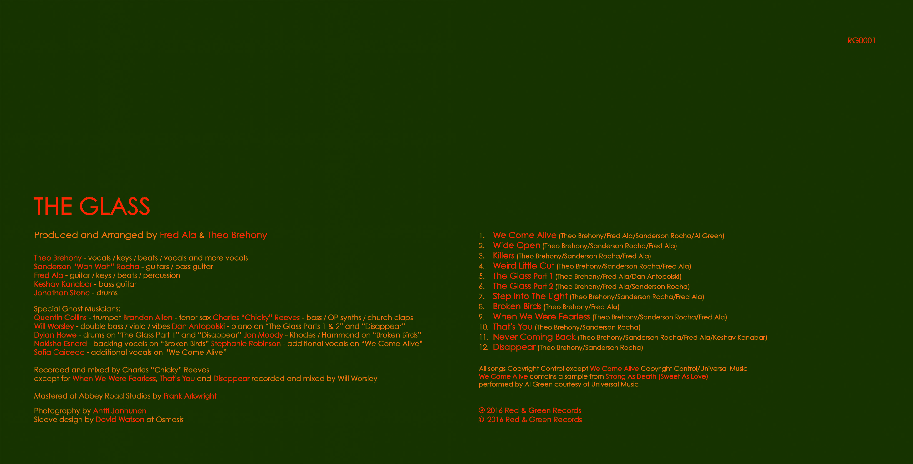
The sound of the music suggested inspiration from Marvin Gaye, Stevie Wonder, 1960s jazz and modern hip hop records. The colour layout for the lettering pages was glass bottle green with two different shades of orange for the script, inspired by soul records of the 1970s as well as the colours used for the lettering on many classic 1960s Blue Note records. This colour theme was carried through to the CD itself. FRONT COVER BACK COVER INNER PAGES


